Messaging, value proposition, voice and tone with complete brand identity for a supplier
One of the most technologically advanced suppliers of packaging, cleaning and office supplies in Tennessee, is also one of the oldest companies headquartered in Nashville. American Paper & Twine has stayed one step ahead of the changing times, by offering the right selection of products, at the right price, delivered on time with advanced logistics. A growing company with offices from Arkansas, Alabama and Georgia and every major city in Tennessee, their workforce also spans multiple generations. Knowing they had to compete for talent, in competitive markets, they needed to solidify their core beliefs, value proposition, voice and tone, with overall branding to speak to different generations.
Should the name be changed?
The name American Paper & Twine, posed some challenges. On the positive side, the name had very strong recognition locally in Nashville, and it stood out from every other supplier in the industry. However, the brand logo had not been updated in years and was tied to historical imagery that didn’t lead customers to thinking about technology of today. Changing the name had been talked about over the years but was never seriously considered, because of its historical significance. Which again posed challenges. In our research, we wanted to find out what customers, suppliers and employees thought about the name.
We started interviewing key individuals in the company about multiple topics including the name and how they talked about the brand with customers. We also interviewed customers about the company, their service and also the name. Our findings were very interesting. The company had a reputation as a preferred supplier among most customers, well ahead of their competitors delivering more than promises. Their service was so good, the name was never an issue. Instead, the name was tied to excellence in service, supply and price. The real challenge was not the name for customers, but the name and presentation of the company for future employees.
Brand strategy
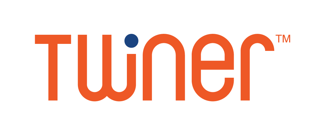
We did a review on competitors’ names in the marketplace and realized if they changed their name, they would actually lose more equity than gain attention. They were already an “American” named company. That part fit in like everyone else. What made them unique, and set them apart from the competition was the word Twine. We knew by keeping that word, it was going to be the focal point of the brand. So rather than try to hide Twine, or minimize it, we recommended embracing and building on its uniqueness.
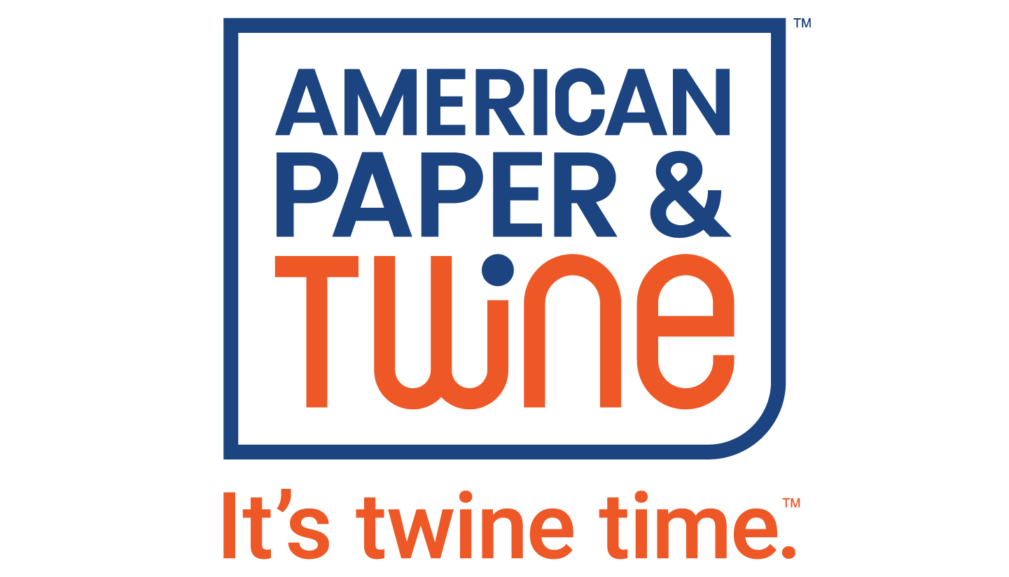
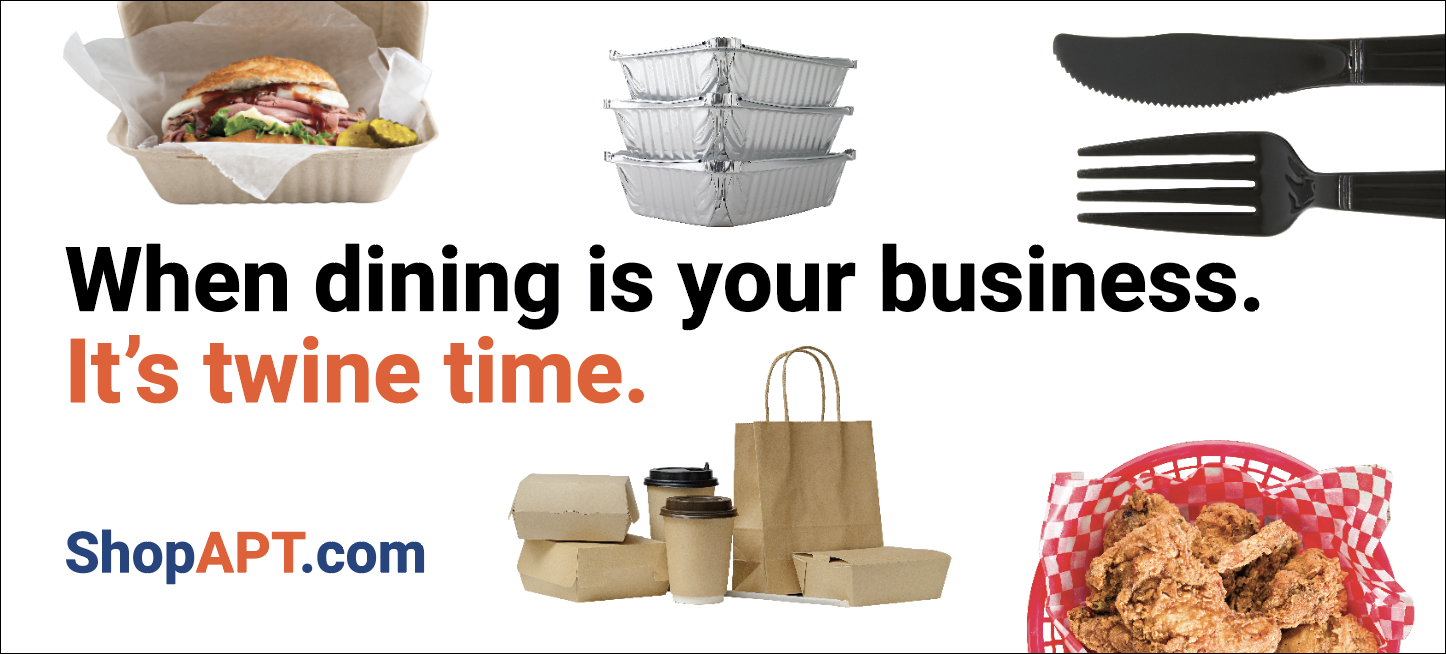
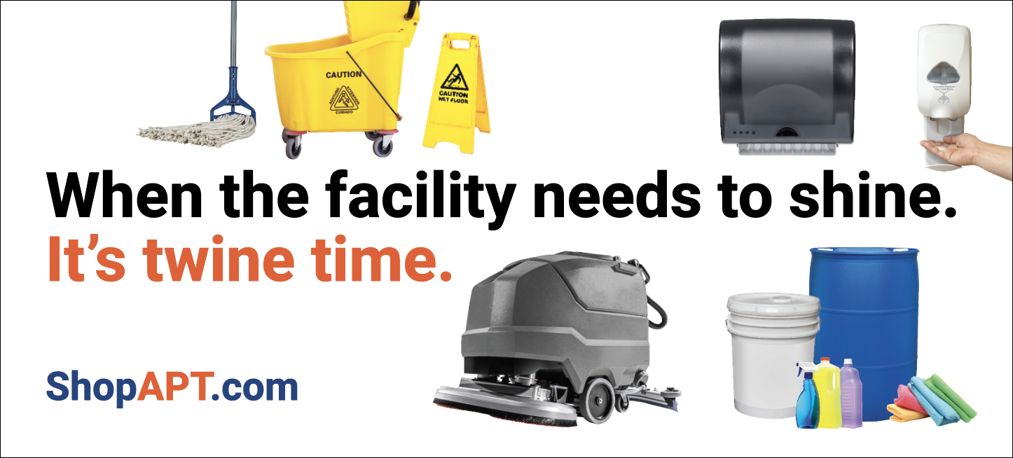
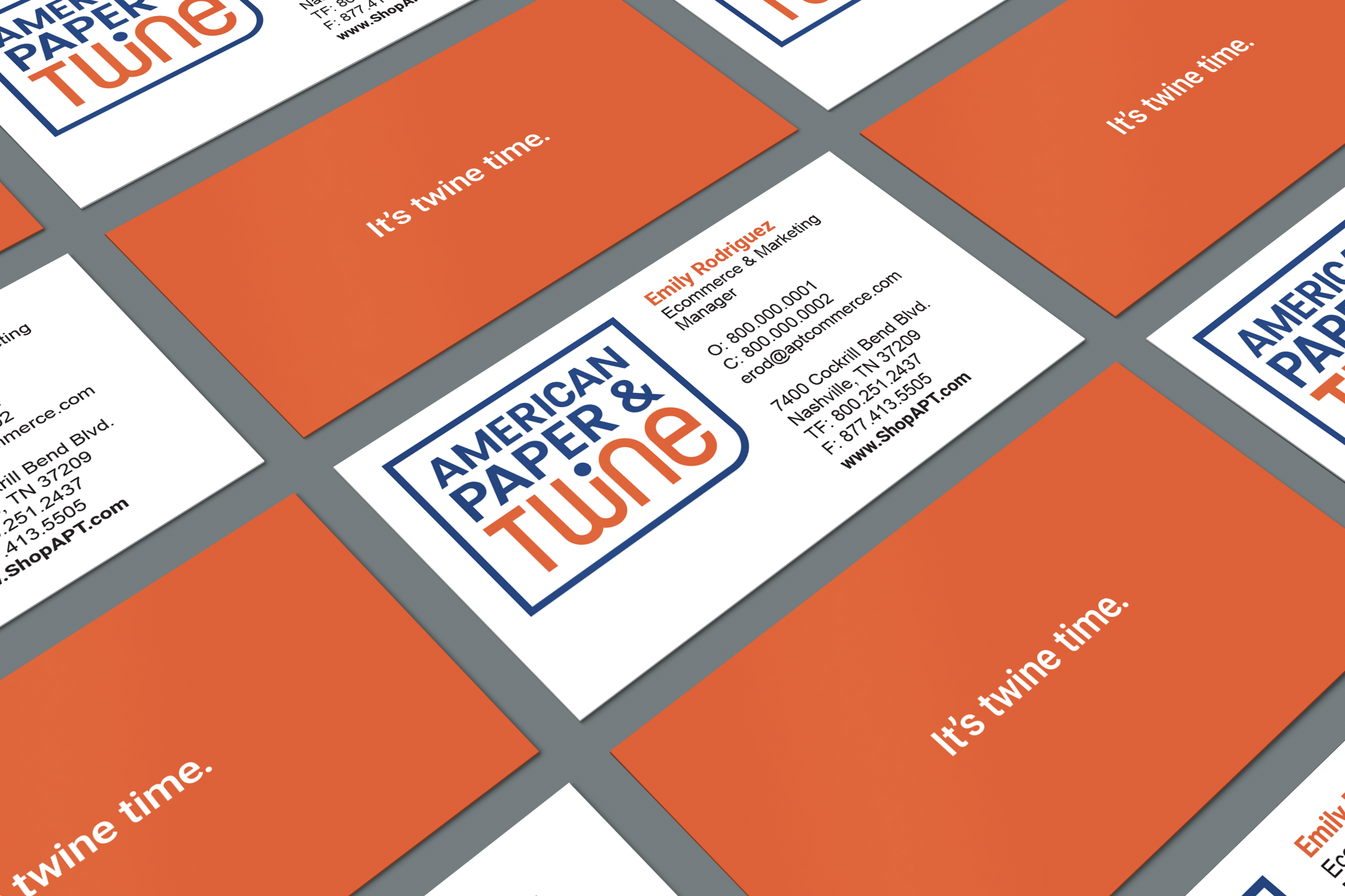
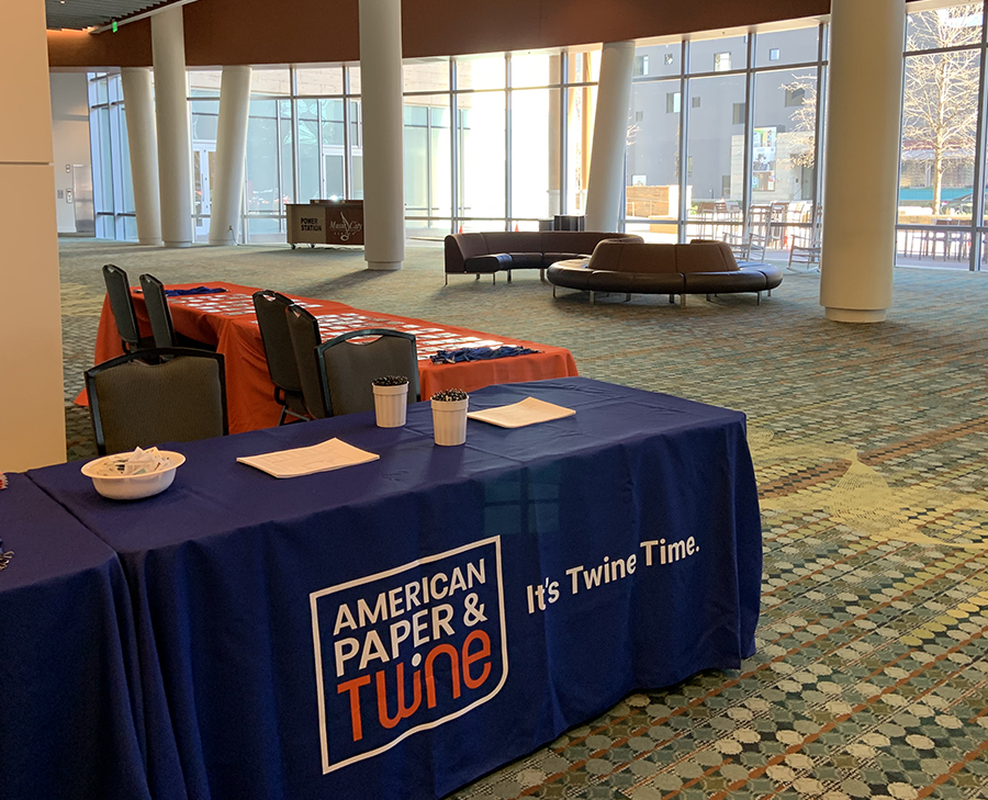
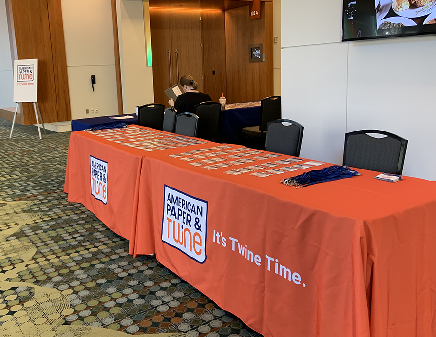
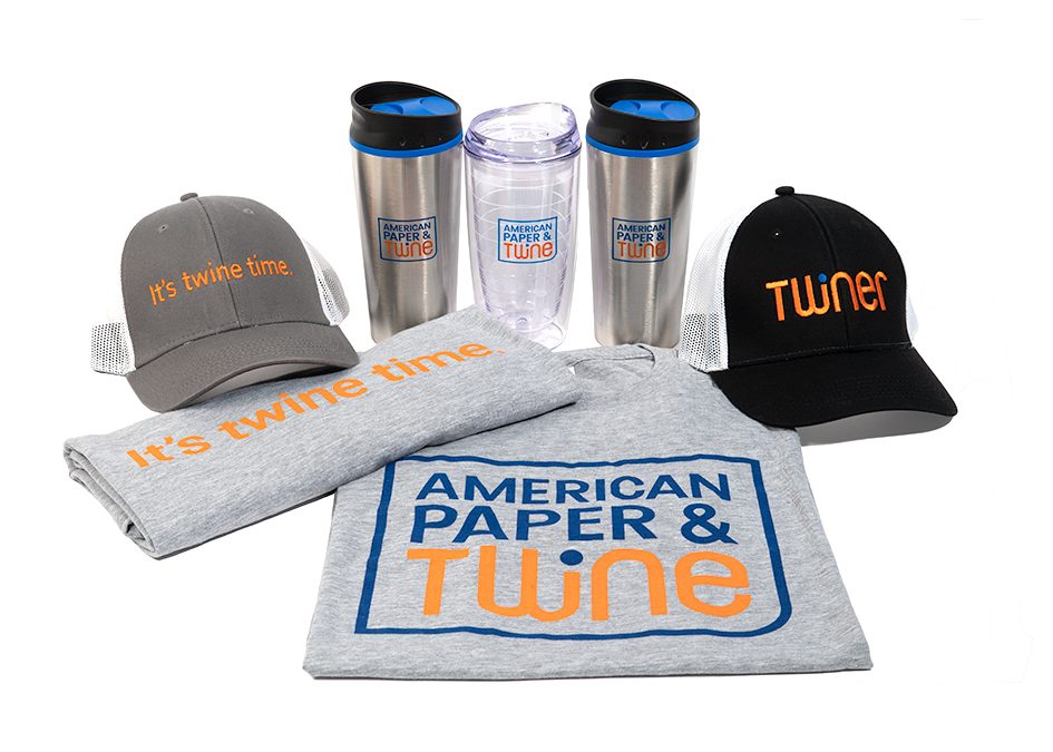
Twine is strong and interwoven. It’s the thread from past to present. Twine is real. An original tagline was created based on a new value proposition. The tagline solidified the word twine with the company’s reputation for service. “It’s Twine Time” became a memorable and unique part of the brand voice and tone.
The word “twiner” became part of the brand language. Twiners are the people who make up American Paper and Twine. They make “Twine Time” happen. It’s a distinct word that separates from competitors, and extends the brand.
Visual identity
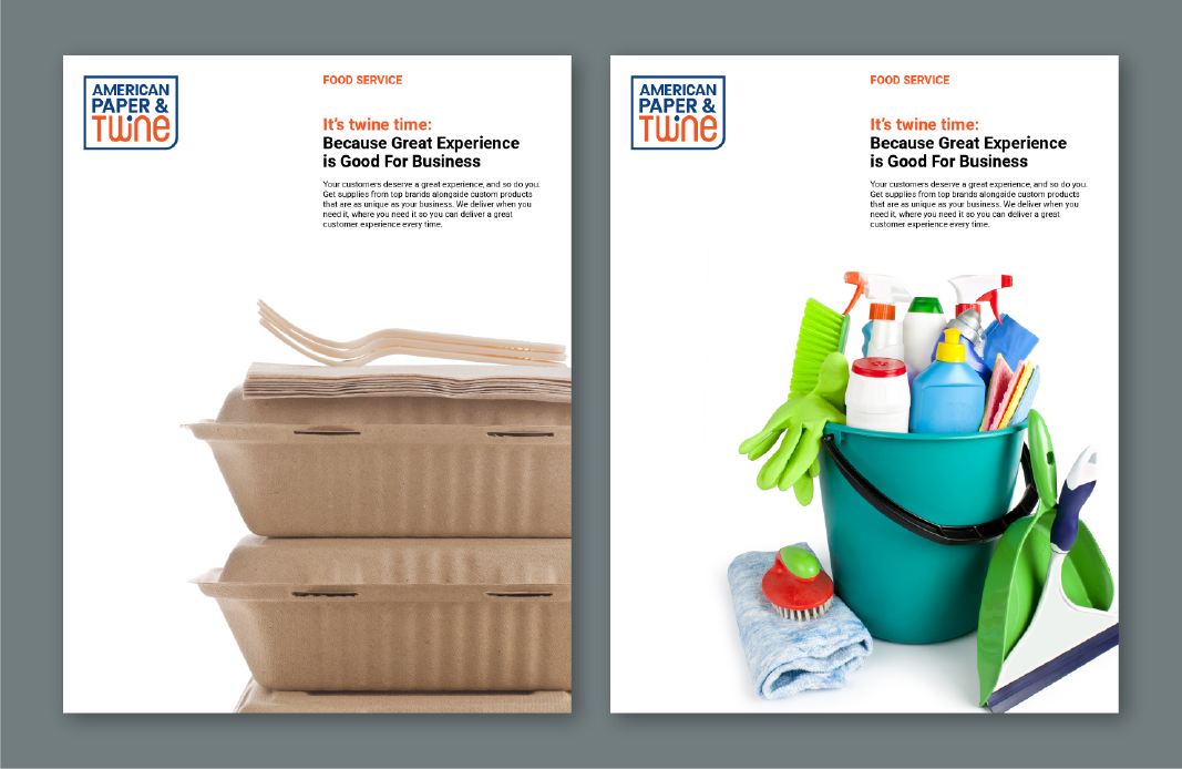
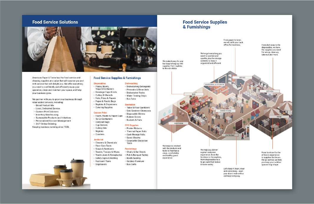
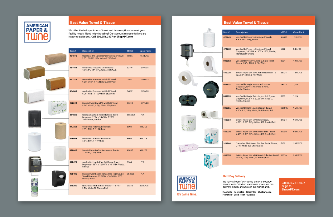
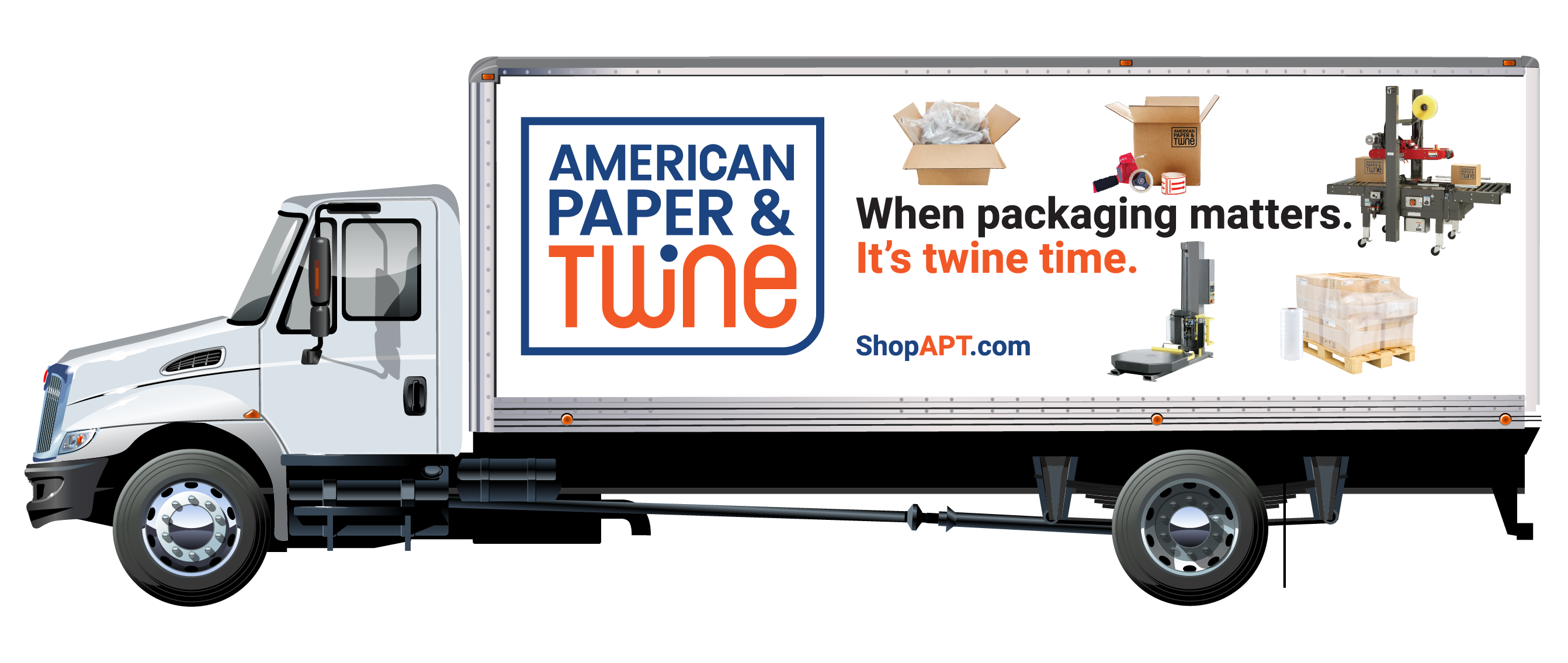
A new logo was created to mondernize the overall look and feel of the brand. The word Twine, drawn as original artwork, moves like a thread from left to right with rounded curves in the letterforms. The entire logo is built with fonts from small to large and bordered in a shield. It’s a fresh interpretation of the name and is easily recognizable in multiple forms of marketing communication. Brochures, sell sheets and promotional materials were all created with the logo and color scheme as an integrated part of the design. We updated the color palette from black to energetic blue and youthful orange. The color combination has many variations when used in promotional materials.
Their large fleet of trucks covers territory from Arkansas to Georgia, and is a great platform for campaigns and brand impressions. The tagline is the answer to specific questions on different trucks. Highly visible and well received, the trucks tell their story in a memorable way.
Brand communication materials are being rolled out continuously. The new brand has been well received by employees and customers. Not changing the name has saved the legacy of the brand, and the new strategy sets a solid foundation for marketing in the twenty-first century.
Work Completed
- Overall Brand Strategy
- Messaging, value proposition and core values
- New tagline "It's Twine Time"
- New visual identity, logo, look and feel
- Brand campaign